New Year, New Hue | Color Trends for 2025
Brooke Cleaver November 26, 2024
Fall is a season of transition, and it’s also the time when the world’s leading color experts reveal their top picks for Color of the Year—choices that shape the interior landscape for years to come.
Last year, we saw a shift toward self-care and personalization with rich midtones, uplifting hues, and bold blues. Moving forward, that same sense of individuality is amplified through bold berry tones, grounded mid-tones, and forward-thinking neutrals.
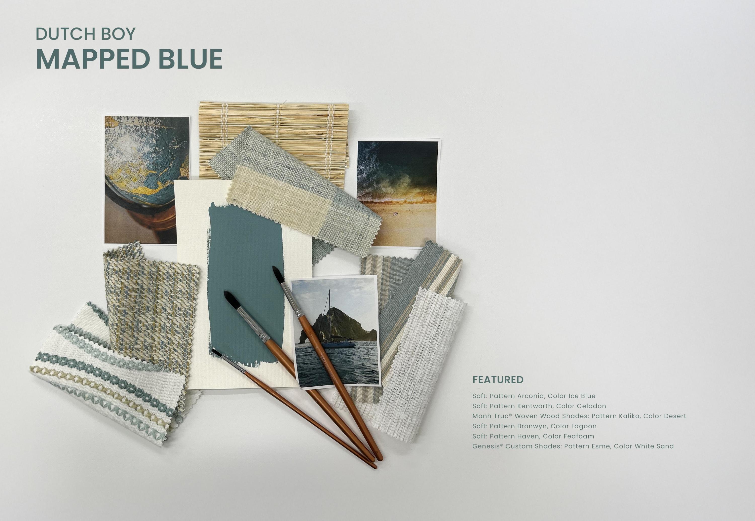
Find Calmer Waters with Mapped Blue by Dutch Boy®
Dutch Boy sets course for calmer shores with its top pick, Mapped Blue, an ethereal yet grounded blue that echoes the gentle waves of the Mediterranean Sea. It features light yellow undertones, resulting in a balmy blue that teeters between hot and cold, making it the perfect neutral—and mid-tone—for those wishing to dip their toes (or jump) in the proverbial color pool. What truly sets this tone apart, however, is its old-world charm and timeless appeal.
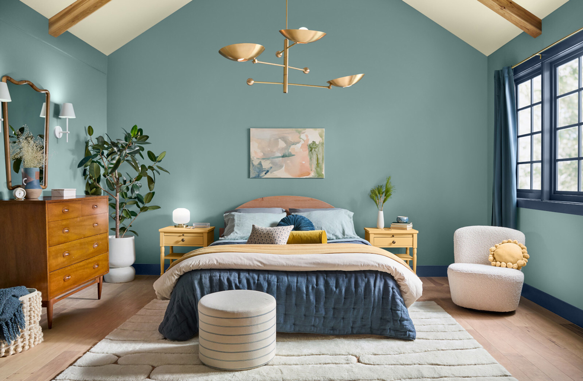 Photo: Courtesy of Dutch Boy Paints
Now, more than ever, consumers are focused on choosing colors that don’t just reflect their current mood but their future ones. “Our 2025 Color of the Year, Mapped Blue, is more than just a trend: It’s a reflection of changing consumer values,” Lisbeth Prada, Color Marketing Manager for Dutch Boy Paints, stated in a recent press release. “We’re seeing a significant shift, particularly among Millennials and Gen Zs, towards products that offer durability, functionality, and timeless aesthetics. Mapped Blue answers this call, providing a classic yet modern charm that can adapt to various design styles and stand the test of time.”
In an era of economic uncertainty and societal pressure, people are seeking hues that are both personal and persistent, and with its warm, honeyed undertones, Mapped Blue does just that. It pairs beautifully with natural elements like wood, stone, and greenery, offering homeowners a timeless escape into a world that is calm, warm, and quiet.

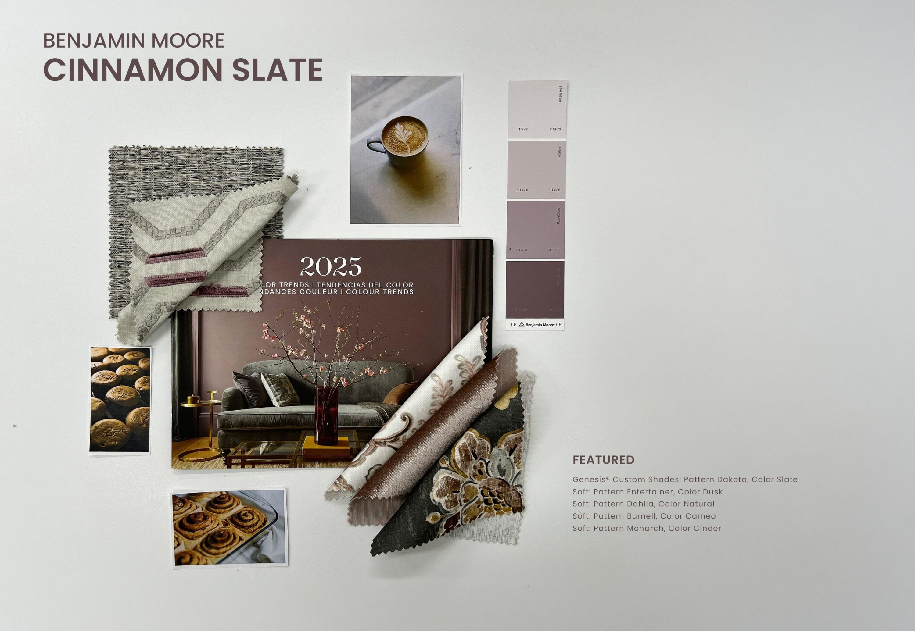
Pick Peace with Cinnamon Slate by Benjamin Moore®
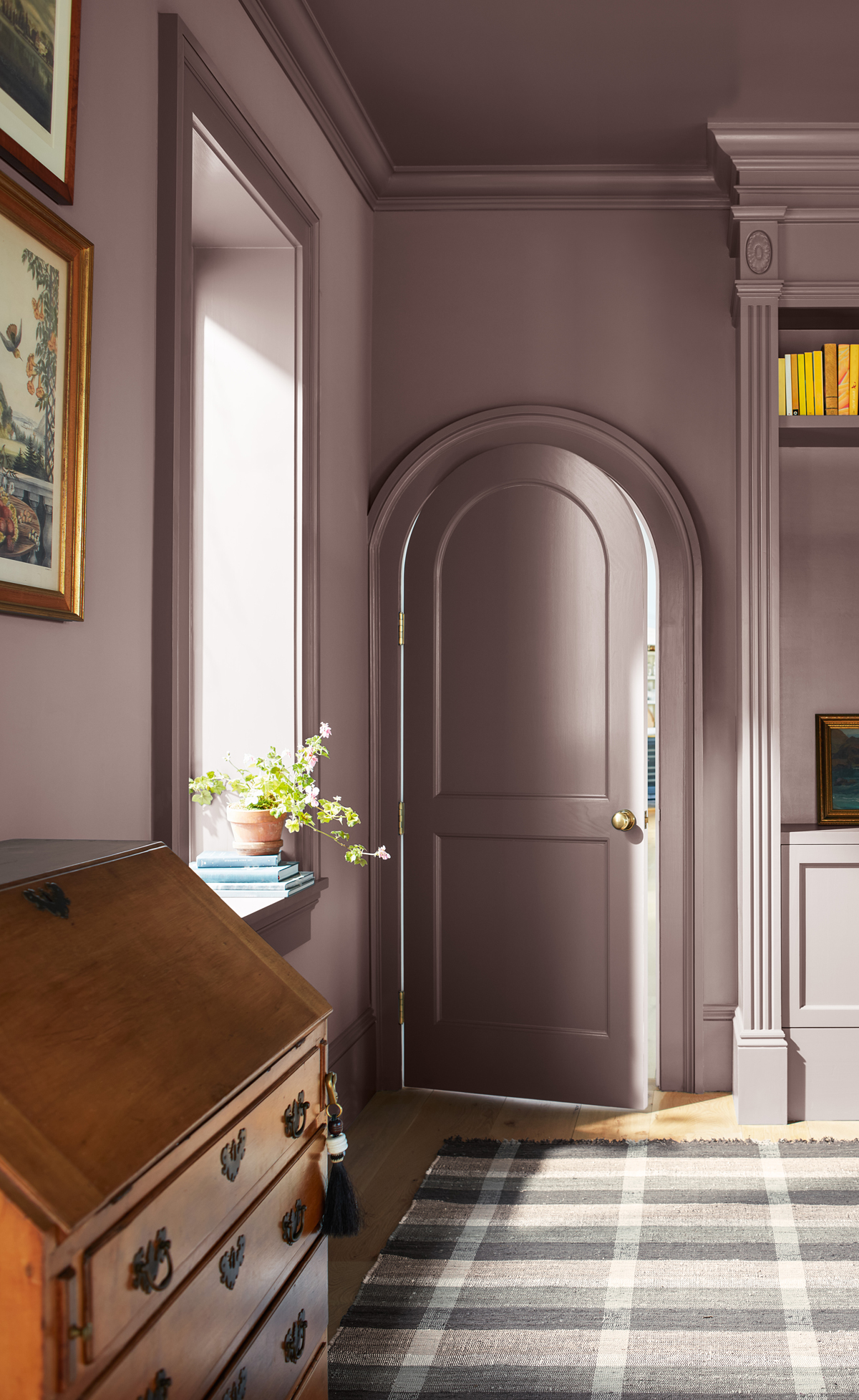
Last year, Benjamin Moore asked us to reach for the stars with their eye-catching hue, Blue Nova. This year, they’ve chosen to roam a little closer to home with their velvety brown pick, Cinnamon Slate: a soft and sophisticated neutral teeming with beautiful plum undertones akin to that of a lavender field. Depending on lighting conditions and surrounding accent points, this versatile shade can shift from an earthy, grounded brown to a romantic, muted mauve, leading to a plethora of design possibilities.
 Photo: Courtesy of Benjamin Moore & Co.
When asked about their newest color of the year, Andrea Mango, Director of Color Marketing and Design at Benjamin Moore, stated, “As the use of more saturated colors in design has increased in recent years, we are seeing a growing interest in more nuanced colors, whose undertones add intricacy and dimension[.] Cinnamon Slate is an inviting hue that offers enduring style and modern sensibility. Its depth and richness bring an air of approachability and sense of comfort throughout the home, making it a new favorite for years to come.”

Find your Inner Voice with Purple Basil by Glidden® and PPG®
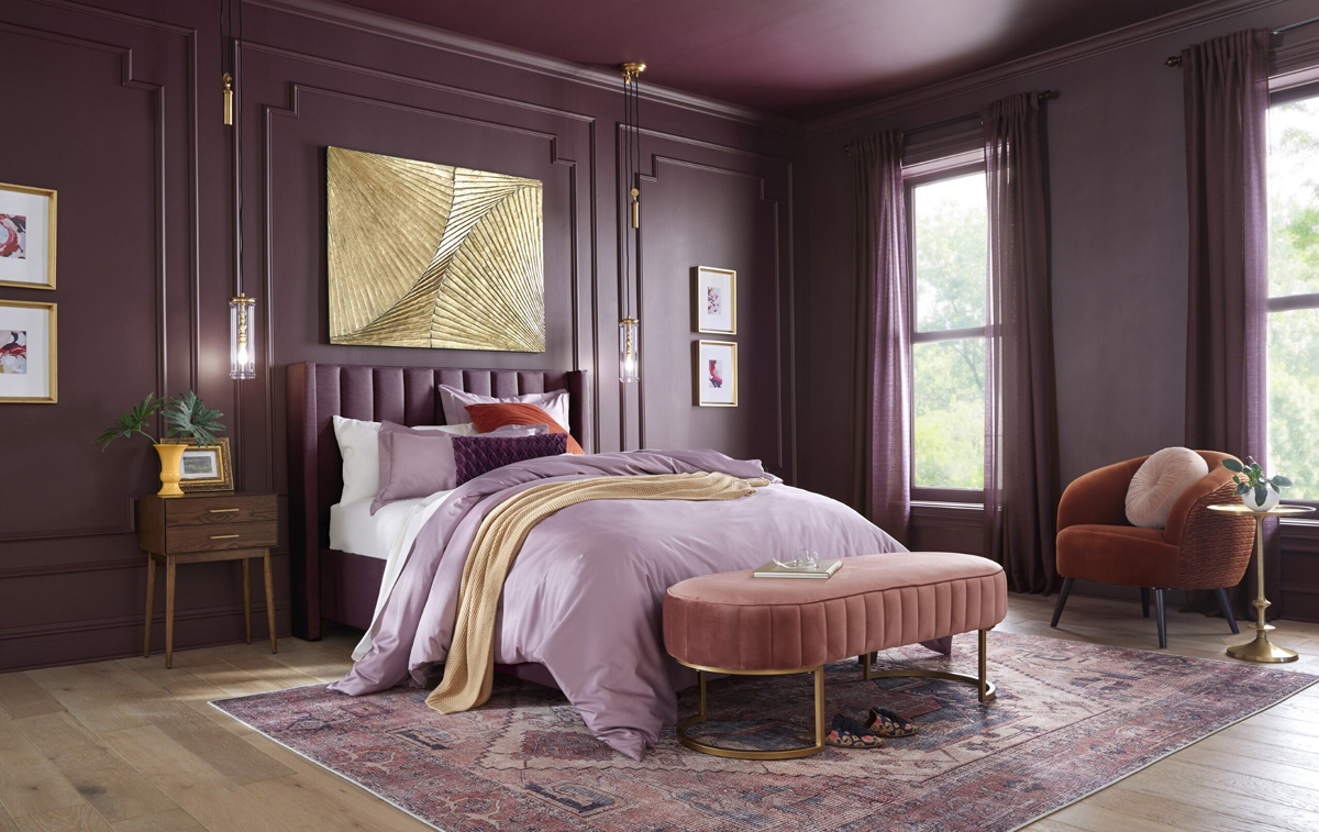
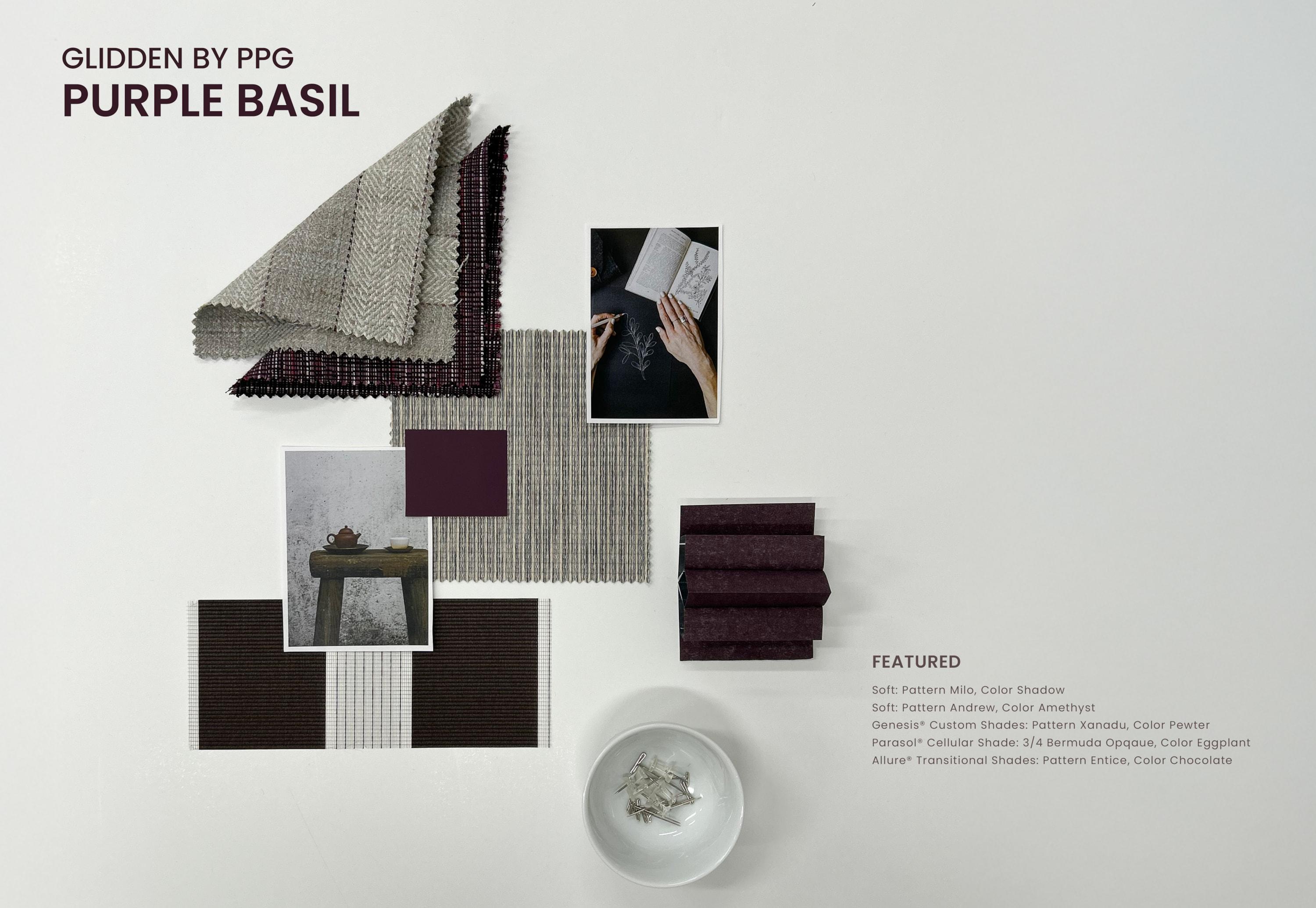
The verdict is in: purple is the color of the hour, and Glidden’s top pick, Purple Basil, only reaffirms it. Much like its namesake, this deep, jewel-tone hue offers a restorative, empowering effect, both on the home and the psyche, through its unapologetic embrace of color. Unlike Benjamin Moore’s Cinnamon Slate, which highlights the beauty of subtle undertones, Glidden Paints by PPG celebrates vibrant, headlining hues with their bold and versatile choice.
 Photo: Courtesy of PPG
Rather than shying away from color, Glidden encourages consumers to be courageous, confident, and unabashed in their next color selection. “So many people start their color selection journey looking at bold hues, but ultimately settle for a more expected or muted color,” stated Ashley McCollum, PPG color expert, in a recent press release. “This year we are encouraging these ‘color chip daydreamers,’ as we call them, to put aside trepidation about what the neighbors will think or potential resale value. For 2025, purple isn’t just permitted, it is encouraged.”
So, whether you’re updating window treatments, adding accents, or repainting walls, take PPG’s advice and let bold, beautiful colors lead the way with confidence.

Be Bold with Rumors by Behr®
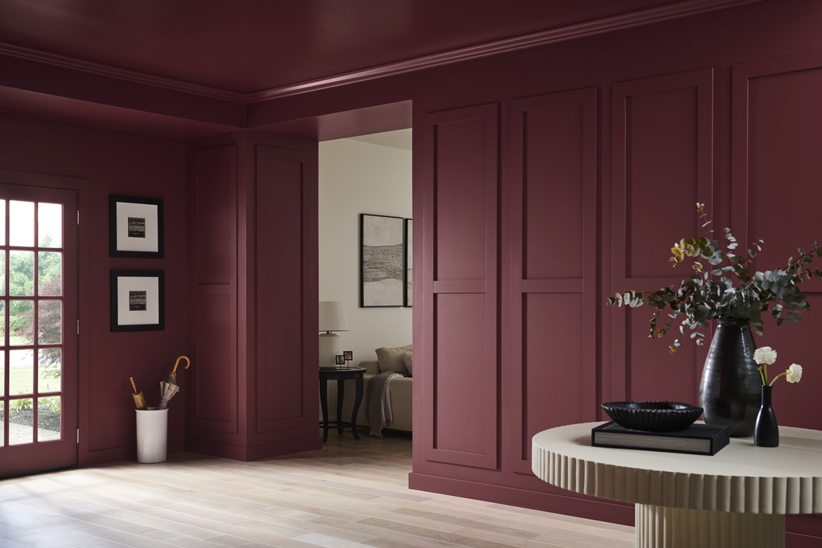
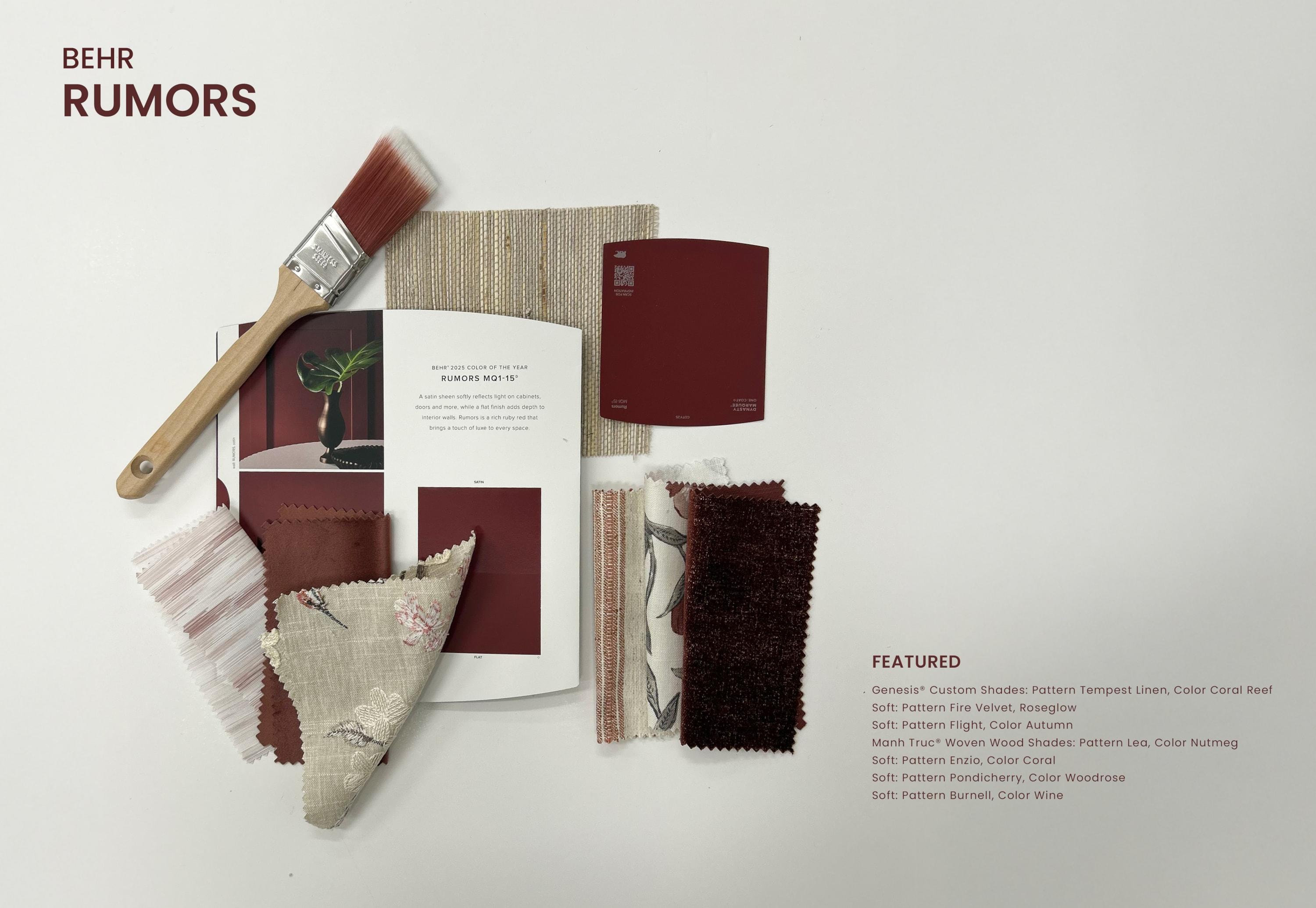
Move over, Dorothy—there’s a new red in town, and it goes by the name Rumors. Straying from previous picks like Blank Canvas and Cracked Pepper—two timeless neutrals in contrasting tones—Behr has chosen a sultry, sumptuous red for their 2025 selection. Over the past year, ‘90s nostalgia has infiltrated the current zeitgeist, inspiring countless design firms and fashion houses (think of the recent revival of the Nancy Meyers aesthetic). Now, that same sense of nostalgia is being poured into the paint world with Behr’s bold but calming new hue, Rumors.
 Photo: Courtesy of Behr Paint Company
Its gorgeous brown undertones offer a sense of depth and serenity not commonly found in reds, making it an easy transition for those new to the world of color. “We’re seeing people embrace color like never before,” says Erika Woefel, Vice President of Color and Creative Services at Behr Paint Company. “Rumors is a modern take on a timeless red, offering an energetic appeal for a lasting, stunning statement.”
Whether it be through the art of color-drenching (painting the walls, trim, and ceiling of a room) or subtle pops of color, Rumors is a playful yet grounded segue back into the realm of pigment.

Embrace Change with the 2025 Color Capsule by Sherwin-Williams®
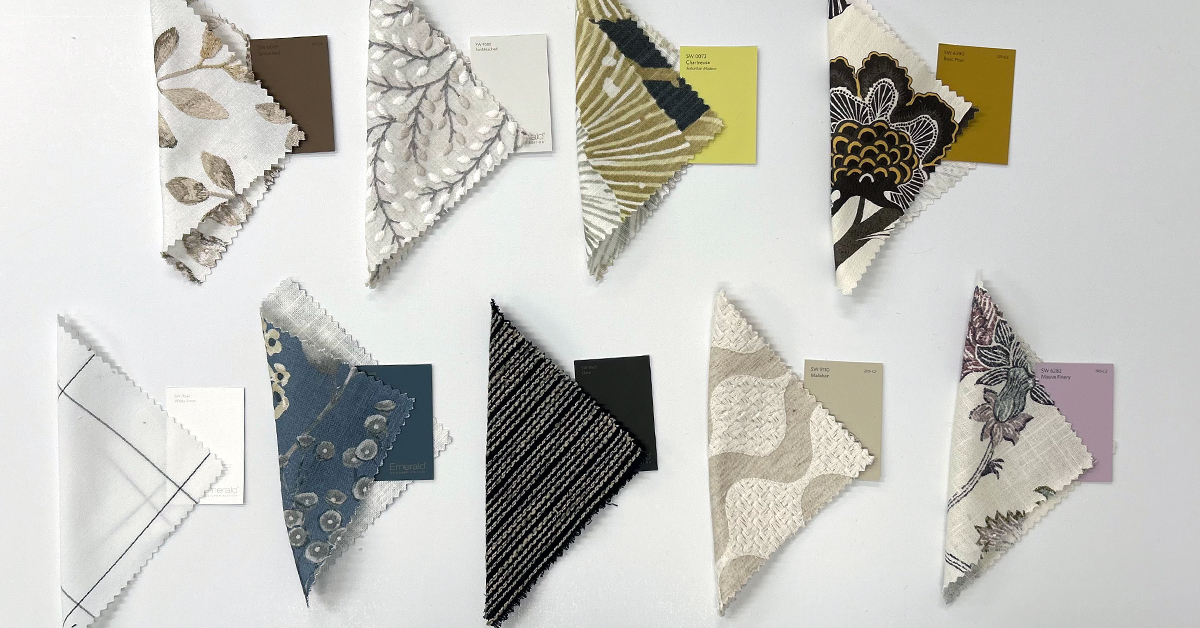
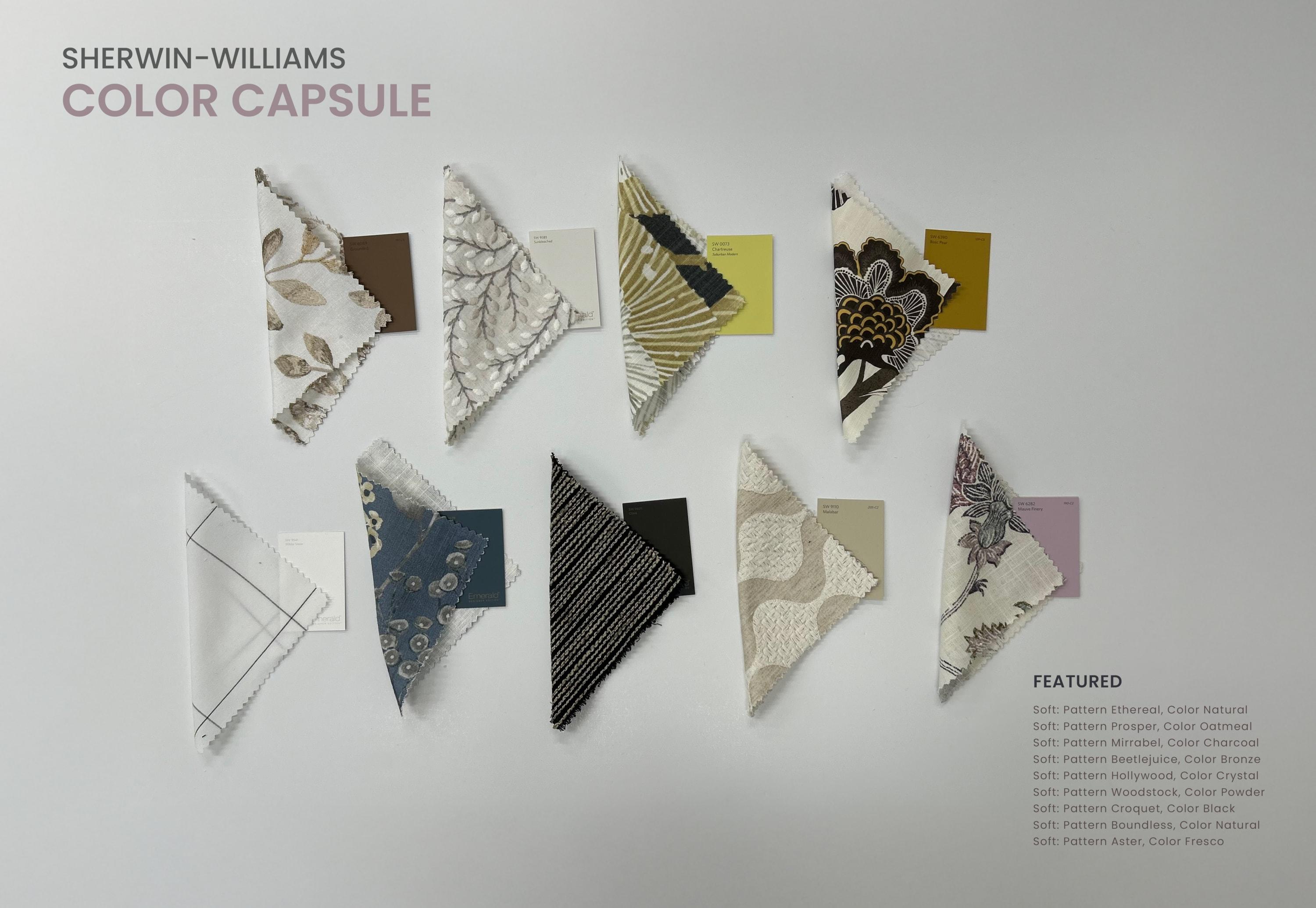
Two years ago, Sherwin-Williams asked us to return to nature with their red-based beige, Redend Point. Last year, they rose above with their breezy yet blissful blue, Upward. This year, they’re embracing the concept of change and innovation with not one but nine colors of the year with their first ever Color Capsule. This change of pace coincides with their 15-year anniversary of announcing Colors of the Year—resulting in a combination of balanced, usable colors that are grounded in nature. Included in the collection are the following colors:
- SW 6089, Grounded – A calm and rich brown that wraps you in its warm and comforting embrace.
- SW 9585, Sunbleached – A bold and versatile white that is perfectly positioned between hot and cold.
- SW 0073, Chartreuse – Halfway between green and yellow, this vibrant, eclectic hue provides a bold yet grounded backdrop for your home.
- SW 6390, Bosc Pear – Similar to that of its namesake, this organic, golden hue harkens back to its Parisian heritage.
- SW 9541, White Snow – Light, bright, and brilliant, this designer white offers professional results, regardless of skill level.
- SW 9639, Rain Cloud – Aptly named, this dark and moody, grey-based blue mimics the sky on a dim and stormy day.
- SW 9605, Clove – Bordering between black and brown, this dark, oaky hue offers a sense of rustic charm and nostalgia.
- SW 9110, Malabar – Reminiscent of a day spent along the beach, this soft and sandy beige opens the door to all that is warm and inviting.
- SW 6282, Mauve Finery – This soft and pale purple soothes the senses, akin to that of an English garden.

“It’s very special to commemorate our 15th Color of the Year anniversary by expanding to an entire capsule that is a modern, fresh take on color, with a balance and usable assortment of shades,” says Sue Wadden, director of color marketing at Sherwin-Williams, in a recent press conference. “Together—as a complete palette or in expertly picked parings—the capsule’s alchemy creates something to be treasured in any style or setting.”
Shiver with Anticipation with Pantone®
Every year, Pantone delivers their Color of the Year. And every year, we wait with bated breaths. This year is no exception. Last year, they offered us a soothing slice of self-care with their 2024 pick, Peach Fuzz—a gentle and velvety orange that focused on closeness, connection, and compassion. And in a year fueled by economic, political, and technological flux, we’d say their pick was right on the mark. In times of change, colors that enable feelings of inner peace can help us transition from one stage of life to the next.
This leads us to the biggest question of all: What will Pantone bring to the table in 2025? Luckily for us, forecasters at WGSN and Coloro have already made their predictions. They believe that purple will make its triumphant return in 2025 with their top pick, Future Dusk: a dark and enigmatic hue that lies somewhere between violet and midnight blue. Experts at WGSN described the color as having a sense of “mystery and escapism,” one that “feeds into themes of transitions, whether it be moving from dark to light, or dusk to dawn – making it perfect for a period of immense change.”
This brings us back to the question at hand: Will Pantone follow suit and join its contemporaries, like Benjamin Moore and PPG, by choosing a dark and mysterious purple, or will they move in a completely new direction? We’ll just have to wait and see.
Final Thoughts
Whether you’re drawn to earth tones that ground and soothe or bold hues that excite and inspire, one thing remains true: the world of color is still very much alive. What are your thoughts on this year’s Colors of the Year? Which hues stood out to you, and what plans do you have for incorporating these shades into your space? We’d love to hear from you. Join us on Instagram, Facebook, and LinkedIn to continue the discussion.
Lafayette Interior Fashions is a family-owned, to-the-trade manufacturer of blinds, shades, shutters, draperies, and other custom-crafted interior fashion products. To learn more about our products, Find a local dealer near you.
 Photo: Courtesy of Dutch Boy Paints